


Re: Studying layout as its own editorial object
Page Studies: How the sexiest thing on the page might be a page number and other things.

This week, I’m indulging a long-standing passion: editorial design. Specifically, the art of the page—how words, images, margins, and type come together to create a reading experience that’s not just legible, but engaging. Whether it’s a magazine spread that stops you mid-flip or a perfectly typeset essay, layout does more than organize content—it shapes how we feel about it.
So in the spirit of celebrating the beauty of layout, I’ve gathered a small archive of editorial designs and page treatments that have inspired me lately. They’re thoughtful, inventive, sometimes gently radical compositions that remind me what the editorial form can do.
Re: is a midweek recap of my research, reviews, recommendations, and reactions, featuring curated short-form responses. Re: is inspired by the culture and practice of responding.

MIXING TYPE
1. Lamm Kirch, catalogue of Eva Berendes, Spector books, 2022.
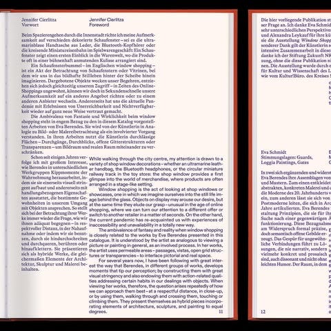
Mixing serif and sans serif is a classic, but I still love it, and especially when it’s so subtle you’re not even sure they’re different fonts. Here, the distinction marks the switch between languages—serif for German, sans for English. That’s a clever and creative solution, which is usually the best reason to mix fonts—when it becomes an organizational tool.
Bonus points go for the super subtle, in-between color that defies cateogrization: is it blue? Is it purple? (Is it serif? Is it sans? It keeps you looking.)
DENSITY: TEXT = TEXTURE
2. Bizzari Rodriguez, Frac Île-de-France, La collection, 1983–2019.
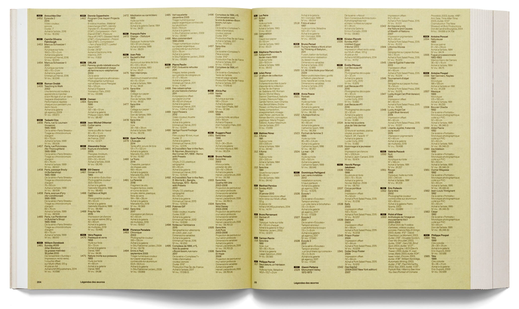
I’m a fan of overpopulated pages—text, images, all of it. But of course, there is a time and place for that too. Especially for index spreads, where a consistent, dense rhythm creates a texture of its own. Abit of maximalism with intention never hurts anyone.
WHITE SPACE
Then there’s white space—which only becomes more powerful in contrast to all that density. The general rule is the same as with any other medium: white space lets the composition breathe, and draws attention to what is on the page. But for me, the key word when thinking about white space in editorial design is the same one I mentioned earlier: composition.

White space works best when you treat and approach the page like a composition. Also being bold with it—and not just little gaps between images or lines, but I mean truly bold, massive, deliberate areas of nothing—can really level up the page. The mindset should not be one where you task yourself with “leaving white space,” but one where you think of “creating a composition.”
3. Jack Halberstam, “This Is Not a Love Story” from the Ex Machina Screenplay book for @a24

This one’s another example of effective use of white space. Text here is arranged in columns that read more like visual blocks which construct its own dynamic and composition. Apart from the white space, this layout also creates an alternating rhythm and pattern of columns: text + image + text + image.
4. Zine Magazine, Issue 19

This image has been orbiting my Pinterest for a while, saved in at least three folders. I love the sharp block of image and color on the top half of the spread, with the bottom half left empty. I also like that the top halves work together here, rather than contrasting the weight distribution between the left and right sides of the spread.
NUMBERS
I think numbers are incredibly sexy, and I love when they’re given more of a spotlight in design. They’re part of the text, but not quite; they float somewhere between the structure of language and the autonomy of imagery. I’m talking chapter numbers, image captions, and especially page numbers—particularly when they’re relocated from their usual corners to somewhere unexpected. It’s a small move that makes you more aware of the page itself. There’s something about having to look for them that keeps you present, though I won’t claim they hold any moral value.